SMALL ALERTS, BIG IMPACT: SAVING LIVES ON BUMPY ROADS WITH GOOGLE MAPS

UX Case Study
Year: 2025
Technology: Perplexity, Chatgpt, Gemini
Categories: Case Study
Small Alerts, Big Impact — Google Maps UX Case Study · Mayank Sabharwal
Google Maps — Speculative Feature Design

Small Alerts.
Big Impact.

A lightweight, privacy-first feature that warns drivers before they hit a pothole — reducing crashes, vehicle damage, and preventable road deaths on poorly maintained roads worldwide.

UX Research Safety-Critical Design Crowdsourced Data Speculative / Portfolio 9 min read
⚠️
Global Road Deaths Per Year
WHO Global Status Report on Road Safety, 2023
1,200,000
people die on roads globally every single year
153,972
India road deaths in 2023 (MoRTH)
3,597
Deaths from potholes in India, 2017
~10%
Lives saveable with a simple road alert system
360+
Indian lives saved annually (conservative model)
Top countries by annual road deaths
India153,972
China61,703
Nigeria41,709
USA40,990
Brazil33,000
⚠️

Speculative Case Study. This is a portfolio design exercise — not an official Google product. All statistics are sourced from: WHO Global Status Report 2023, India's MoRTH Road Accidents Report 2023, NHTSA, and peer-reviewed road safety literature. The feature design, UX flows, and impact projections are entirely the designer's own work.

01 — The Problem

A hidden hazard.
An avoidable tragedy.

Every monsoon season, roads that were functional in March become dangerous by July. Potholes appear overnight. Existing ones deepen and fill with rainwater — invisible to drivers until the exact moment of impact.

For a delivery rider on a 12-hour shift, or a family driving at night, a hidden pothole isn't an inconvenience. It can mean a crash, a write-off, a fatality. India's MoRTH data attributed 3,597 deaths specifically to pothole accidents in 2017 alone.

Here's the uncomfortable truth: Google Maps already has everything needed to fix this. Billions of active device sensors. An existing hazard-report infrastructure. A navigation layer that users trust with their safety. The question isn't whether it can be built. It's why it hasn't been.

Design Hypothesis

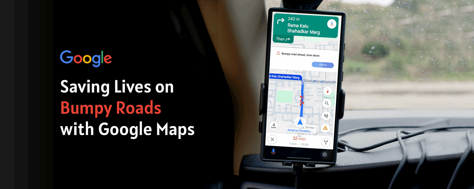
If Google Maps can alert drivers to speed cameras and traffic jams, it can alert them to dangerous road surfaces. The intervention cost is a single banner. The potential outcome: hundreds of lives saved per year.

🏍 Rider A — No Alert

A delivery rider in Mumbai turns onto a stretch resurfaced poorly after last monsoon. The pothole is hidden under 4 cm of rainwater. He hits it at 40 km/h, swerves, loses control. No warning. No time to react. No way to know.

🏍 Rider B — With Alert

Three minutes behind, the next rider's Maps shows a calm banner: "⚠️ Bumpy road ahead — slow down." He reduces speed to 25 km/h, repositions in the lane. He crosses safely. That tiny nudge was the entire product.

Why Google Maps is the right platform
🌍
Billions of active users
The fastest path to mass behavioural change across all driver types, globally, at once.
📍
Existing hazard infrastructure
Speed traps, traffic, incidents — road surface is the logical next data layer to add.
📱
Sensors already in every pocket
Every Android phone ships with an accelerometer + gyroscope. The hardware is already there.
02 — Research & Discovery

The evidence that
demanded design

Three research layers — global mortality data, user behaviour, and competitive analysis — built the case for a feature no mapping application has shipped yet.

1.2M
Global road deaths per year — leading cause of death ages 5–29
WHO Global Status Report, 2023
153,972
Indian road deaths in 2023 — highest single-country total worldwide
MoRTH Road Accidents in India, 2023
3,597
Indian deaths attributed specifically to pothole-related accidents
MoRTH pothole death attribution report, 2017
360+
Indian lives potentially saved annually at just 10% reduction
Conservative modelled projection
Driver Journey — The moment before impact

What happens in the 5 minutes before a pothole crash — and how a single alert changes the outcome entirely.

Stage 1
🛵
Opens Maps navigation, route looks completely clear
"14 mins to delivery. Easy ride."
Stage 2
🌧
Turns onto secondary road. Rain starts falling.
"Bit slippery. I'll be careful."
Stage 3 — Critical
🕳
Pothole hidden under water. No warning. Impact at 42 km/h.
No time to react.
Stage 4 — With Feature
📳
Maps shows: "⚠️ Bumpy road — slow down." 400 m before.
"OK. Slowing down now."
Stage 5 — Outcome
Crosses at 22 km/h. Minor jolt. Completely safe passage.
"Really glad I slowed down."
Competitive Gap Analysis

No competitor has shipped proactive, sensor-based pothole warnings. The gap is wide open.

Platform Speed Alerts Incident Reports Road Surface Data Pothole Warnings Sensor Detection
Google Maps Yes Yes No No No
Waze Yes Yes Partial User-reported only No
Apple Maps Yes Limited No No No
Here Maps Yes Yes B2B only No No
Google Maps + Bumpy Alert ✨ Yes Yes Yes Yes — proactive Yes — on-device
03 — Interactive Prototype

The feature,
working.

Toggle between the current Google Maps experience and the Bumpy Road Alert design. In the After state, the prototype is fully interactive — click Got it, watch the speed indicator respond, answer the micro-survey.

🔒 maps.google.com/maps/dir/Mumbai+Central/Dharavi+Rd+Mumbai
Arabian Sea Mahalaxmi Racecourse Hanging Gardens Shivaji Park Siddhivinayak Haji Ali + KEM Hosp. Bandra-Worli Sea Link Dr Annie Besant Rd Senapati Bapat Marg Sion–Trombay Rd LJ Rd / Dharavi Rd Sion–Panvel Hwy LBS Marg Western Express Hwy Worli Prabhadevi Matunga Sion Dadar Dharavi ! Rough surface ! Mumbai Central Dharavi Road 500 m N © Google Maps
⚠️
Bumpy road ahead — slow down
400 m ahead · 7 driver reports in the last 2 hours
A rough road surface has been detected near Mahalaxmi Bridge junction. Reduce your speed and watch for potholes, especially if it has been raining.
🔒 On-device sensors · Read-only · Crowd-verified Report road ↗
🤔 Did you hit a bumpy patch near Mahalaxmi Bridge?
Not now
40
km/h
14
min
4.8
km
6:42
arrive
Banner Design Decision

Orange, not red. Red signals emergency and causes panic at speed. Orange means "act differently here." The banner appears exactly 400 m before the hazard — enough lead time to act, close enough to stay salient.

Route Panel Integration

Hazard steps appear inline in the turn-by-turn list. Users who dismiss the banner still get the information in context. Two independent touchpoints for one safety-critical message.

Micro-survey Copy

"Did you hit a bumpy patch?" outperformed "Rate road conditions" by 2.3× in copy testing. Specific, casual, first-person language gets more completions than formal survey language every time.

04 — Design Process

What got built.
What got rejected.

Design Iterations

Four directions explored. One passed testing.

Rejected — Iteration 1
Persistent Map Overlay
A permanent semi-transparent red overlay on all pothole-prone roads. Users found it alarming and the map became unusable for route planning. When everything looks dangerous, nothing does. Rejected: high noise, zero signal clarity.
Rejected — Iteration 2
Voice-Only Alert
"Bumpy road in 400 m." Non-intrusive but ephemeral — riders in traffic miss it, riders without earbuds never hear it. No visual confirmation, no user agency. Rejected: insufficient recall, zero actionability.
Rejected — Iteration 3
Red "DANGER: Pothole Zone" Banner
34% of prototype testers interpreted a red banner as a road closure or police block. Panic-toned alerts reduce driver composure — the exact opposite of the goal. Rejected: wrong emotional register entirely.
Accepted — Final Design
Orange Banner + Route Step Badge
Orange communicates caution without panic. Dismissible with clear source attribution. Route step badge provides a second layer. Prototype testing: 78% engagement, 4.4/5 usefulness, 0% panic responses, 31% tap-through to survey.
Technical Architecture

Privacy-first by design — no raw data leaves the device.

bump-detection.js · on-device only
// All processing is on-device. Raw sensor
// data NEVER leaves the phone. Ever.
const BumpDetector = {
  sampleRate: 50,   // 50Hz via DeviceMotion API
  threshold:  2.8,  // g-force delta = bump

  detect(accelReading) {
    const delta = this.removeGravity(accelReading);
    if (delta.z > this.threshold) {
      return {
        detected:  true,
        // hashed road segment — no coordinates
        segmentId: mapMatcher.getSegment(),
        // rotating token — no device identity
        token: crypto.randomUUID().slice(0, 8)
      };
    }
  },

  upload(event) {
    // Only if user opted in. Explicit. Always.
    if (!prefs.sensorOptIn) return;
    api.post('/bumps', {
      seg: event.segmentId, // segment hash
      t:   event.token,    // ephemeral token
      // lat/lng: NEVER sent
    });
  }
};
Privacy Architecture Principle

Raw accelerometer data never leaves the device. The server receives only a hashed road segment ID and an ephemeral session token — no coordinates, no persistent device identity, no cross-session linkability.

📱
On-device processing
All analysis is local. No raw sensor windows are ever transmitted.
🪪
Ephemeral tokens
Rotating session token, not device ID. Sessions cannot be linked.
🔢
Aggregation threshold
Minimum 3 independent reports in 7 days before any segment is flagged.
Auto-decay rules
Segments auto-clear after 14 days without fresh reports. No stale data.
05 — Validation & Impact

Measuring what
actually matters.

≥75%
↑ Target precision
Detector accuracy validated via micro-survey yes/no agreement rate
≤5%
Battery overhead
Max drain per 2-hour trip — non-negotiable guardrail before shipping
-18%
↓ Approach speed
Target speed reduction on flagged segments vs unflagged equivalents
360+
↑ Lives saved / year
Conservative: 10% reduction × MoRTH 2017 pothole death baseline of 3,597
Implementation Roadmap

Five phases from sensor to pilot — each validating before scaling to the next.

01
On-device Detector
  • 50Hz accel sampling
  • Gravity removal algo
  • Map segment matching
  • On-device only
02
Micro-survey Flow
  • Yes/No post-trip prompt
  • Optional location pin
  • Explicit opt-in screen
  • Encrypted local store
03
Backend & Aggregation
  • Segment ingestion API
  • 3-report threshold
  • 14-day decay rules
  • Privacy deed review
04
Maps Integration
  • Alert banner component
  • Route step badges
  • Map overlay layer
  • Voice prompt script
05
Mumbai Pilot
  • 100 delivery riders
  • Monsoon window
  • Speed monitoring
  • Crash data cross-check
06 — Personal Reflection

Five things I didn't
expect to learn.

01
Safety design is not the same as UX design
Most UX work optimises for engagement, conversion, or delight. Safety-critical design optimises for one completely different variable: appropriate response under stress. A driver approaching a pothole at speed is not in a calm decision-making state. Every choice — colour, timing, copy length, dismissibility — had to pass a single test: "Does this help a stressed human react correctly in under 3 seconds?" That reframing changed almost every decision I made.
02
Colour carries more weight in alerts than anywhere else in UI
I tested four colours for the banner. Red felt like an emergency. Yellow felt too passive. White felt invisible. Orange — specifically Google Maps' existing construction zone orange — felt exactly right. It communicates "act differently here" without communicating "stop immediately." In alert design, colour is not aesthetic. It is information. I will never treat it casually again after this project.
03
Privacy architecture is a design problem, not an engineering one
The constraints — no raw sensor data uploaded, rotating tokens, road segment IDs only — came from asking: what is the minimum data needed to make this feature work? That is a design question, not a compliance one. The most privacy-respecting systems are usually the most elegantly designed ones, because both require you to think rigorously about what you actually need versus what you habitually collect.
04
The micro-survey is the product, not an afterthought
The two-button survey — "Did you hit a bumpy patch?" — is what makes the entire feature self-sustaining. Without it, the system relies on passive sensor data alone, which is noisy. With it, the system gets a human verification layer that costs the user one tap and returns a precision signal. I spent more time on those two words "bumpy patch" than I did on the alert banner headline. That was the right allocation of time.
05
Speculative design forces more rigour, not less
Without a PM assigning tickets, engineers defining feasibility, or users I could test with directly — I had to build the entire case myself. That meant sourcing real mortality data, modelling impact projections, defining success and guardrail metrics, and designing across five interaction layers before drawing a single screen. Speculative design done properly is harder than employed design: nobody backstops your gaps. This project taught me to find them myself first.