Executive Summary
In the high-stakes world of global insurance, decision velocity is a competitive advantage. This project involved synthesizing a fragmented Q1 Placement Summary for Marsh, representing over £15.7M in premiums, into a high-fidelity, scannable executive dashboard. By transforming a multi-layered CSV dataset into a structured visual narrative, the design allows leadership to evaluate carrier performance and risk trajectories in under 30 seconds.
The Problem: Data Paralysis
The raw data provided by the placement teams was a classic “data-dump.” While the information was accurate, it was inaccessible for quick decision-making.
- Cognitive Load: Vital KPIs like “Share of Wallet” and “Risk Factor Growth” were buried among thousands of rows.
- Trend Invisibility: Rolling 12-month premiums were presented in list format, making it impossible to spot monthly performance shifts or historical dips.
- Geographic Density: Regional market shares lacked visual weight, obscuring the fact that the South region represented a massive 64% of the portfolio.
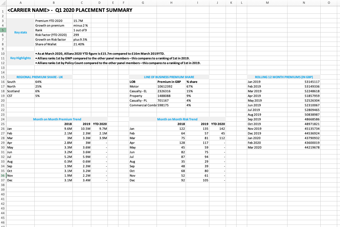
Caption: The starting point: A high-density CSV containing over 15,000 data points across multiple insurance lines.
The Solution: Strategic Visualization
The objective was to move past “making a chart” and instead build a Strategic Intelligence Tool. I utilized a rigid grid and a prioritized information hierarchy to guide the executive’s eye through three distinct layers of data.
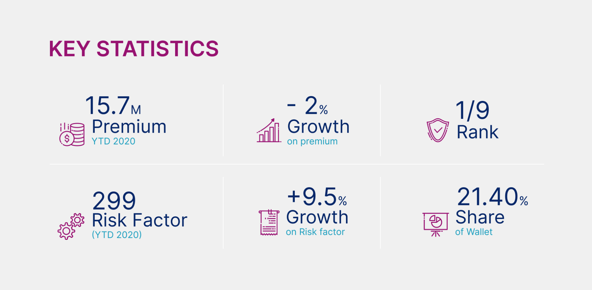
1. The Executive Scorecard (Primary)
I anchored the layout with a high-contrast KPI strip. This ensures the most vital numbers, Total Premium, Market Rank (1st), and Share of Wallet (21.4%), are the first insights a stakeholder encounters.
2. Multi-Dimensional Analysis (Secondary)
- Regional Distribution: A visual weight system immediately highlights geographic dominance.
- Line of Business (LOB): A specialized breakdown showing the Motor segment’s influence (67.5%) versus smaller property and casualty lines.
- Rolling Performance: A trend line visualization that bridges the gap between current YTD status and historical trajectory.
3. Risk Indicators (Tertiary)
By placing Risk Factor Growth (+9.5%) directly alongside a Premium Dip (-2%), the design exposes strategic gaps that might be overlooked in a raw spreadsheet format.
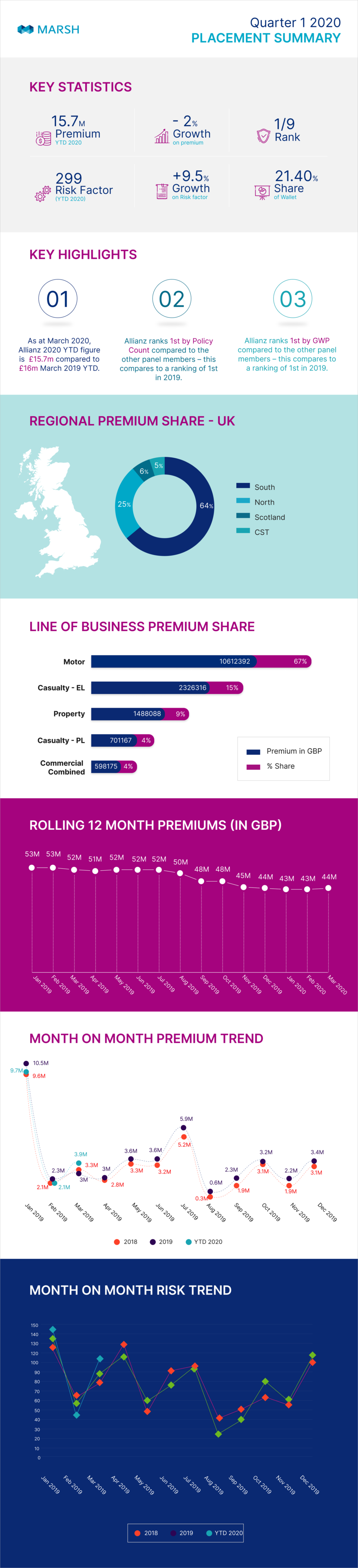
Caption: The final output: A single-page executive summary that balances granular detail with high-level clarity.
Design Strategy & Methodology
- Information Architecture: Audited raw datasets to categorize metrics into a “Top-Down” intelligence model.
- Cognitive Ergonomics: Reduced time-to-insight by using high-contrast color coding for growth and dips.
- Technical Feasibility: Designed with a modular grid system, allowing this static infographic to eventually scale into a live, interactive React-based dashboard.
Business Impact
- Reduced Decision Time: Transformed a several-minute manual audit into a sub-30-second visual scan.
- Enhanced Risk Mitigation: Identified underwriting trends and regional imbalances that were previously hidden in the raw data.
- Single Source of Truth: Provided a standardized visual tool to align regional brokerage teams with global executive strategy.
Technical Stack
- Data Processing: Microsoft Excel
- Design & Layout: Figma / Adobe Illustrator