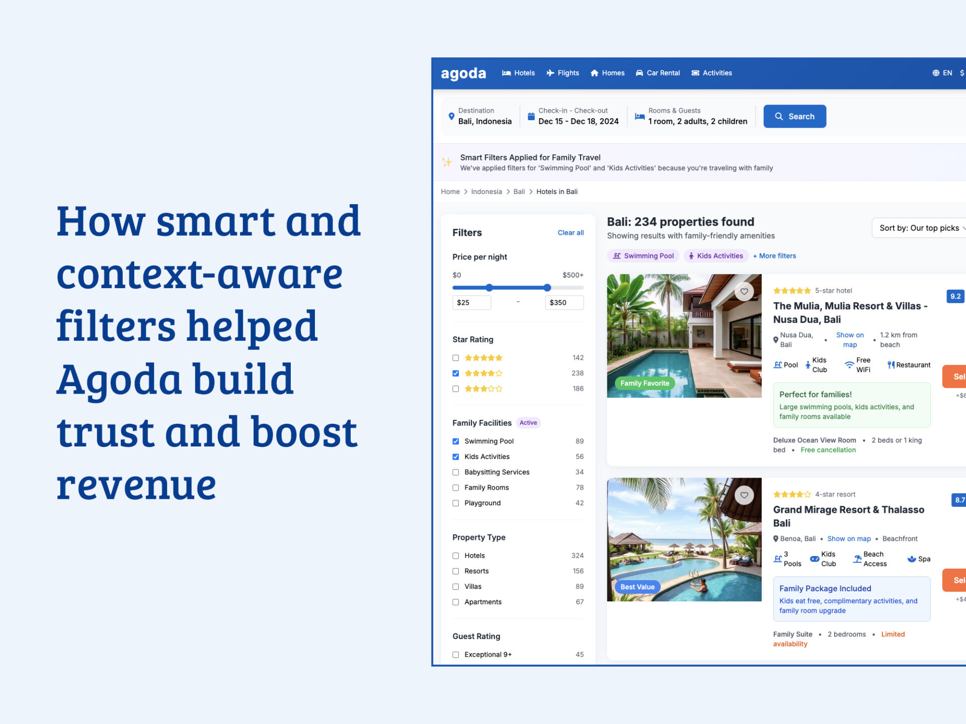
It was a sleepy Wednesday afternoon, and Priya’s mind was already on the upcoming long weekend. With the kids out of school, a last-minute staycation in Bali seemed like the perfect escape. She opened up Agoda.com, her go-to for quick bookings, and typed in “Bali” and the number of guests, two adults, two kids.
The screen filled with hundreds of options, a dizzying array of sprawling resorts, romantic villas, and business hotels. She found herself clicking the filter button, her fingers automatically searching for “swimming pool,” “family-friendly,” and “kids’ club.” This felt less like planning and more like work. “Again?” she thought. “Why doesn’t this site just know I’m with my family?”
Priya’s frustration wasn’t an isolated incident; it was a clear signal of a widespread issue impacting both user satisfaction and the company’s bottom line.
The Challenge: A Crisis of Confidence
The starting point for this product design project wasn’t a feature request; it was a business crisis reflected in two key metrics:
- Negative Net Promoter Score (NPS): A score of -5 indicated that for every promoter, there was at least one detractor actively discouraging others from using the platform. This is a powerful leading indicator of customer churn and negative brand perception in the market.
- Low Customer Satisfaction (CSAT): Post-booking and post-session surveys consistently returned scores below the industry average, with a high volume of comments mentioning a “frustrating,” “difficult,” or “time-consuming” search process.
This data told me that users were not just failing to convert; they were leaving with a negative impression that could permanently damage their relationship with the Agoda brand.
Competitive NPS Benchmark
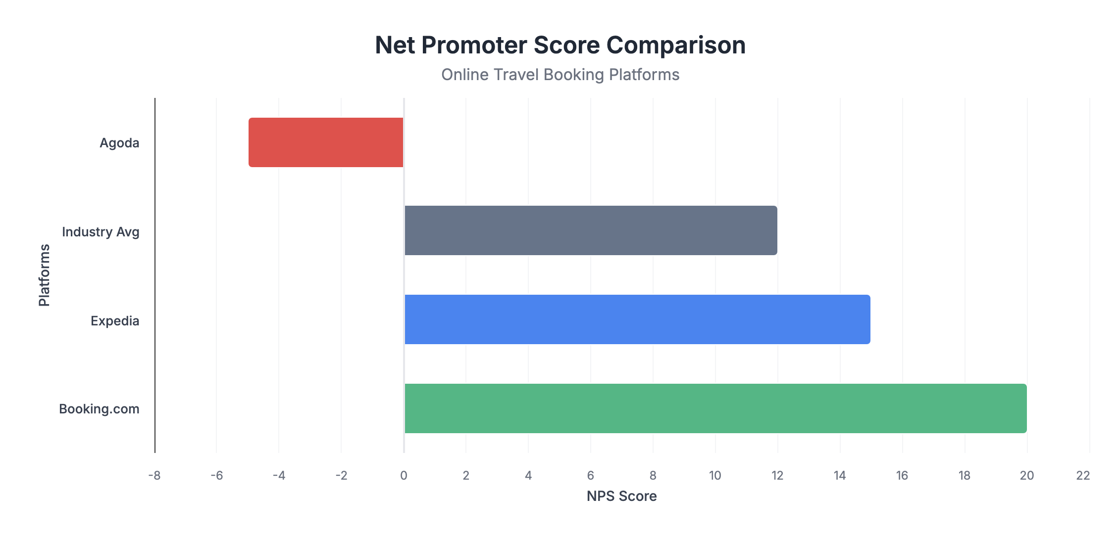
Source: https://www.comparably.com/brands/agoda-company
To contextualize the problem, I mapped Agoda’s NPS against its primary competitors. The gap was stark and demonstrated a clear competitive disadvantage.
- Booking.com: NPS +20
- Expedia: NPS +15
- Industry Avg: NPS +12
- Agoda: NPS -5
Research & Discovery: Finding the “Why”
To move from the what (bad scores) to the why (user pain), I employed a multi-faceted user research approach during the discovery phase.
- Thematic Analysis of User Feedback: I synthesized over 500 app store reviews (iOS/Android) and support ticket logs that mentioned “search,” “filter,” or “find.” The most frequent negative theme, appearing in over 40% of comments, was the repetitive and laborious nature of filtering.
- Heuristic Evaluation: I conducted an evaluation of the existing search and filter flow based on the Nielsen Norman Group’s 10 Usability Heuristics. The system scored poorly on “Flexibility and efficiency of use” and “User control and freedom,” as it offered no shortcuts or accelerators for frequent user tasks.
- Competitive Analysis: I reviewed the search experiences of 5 competitors (Booking.com, Airbnb, Expedia, MakeMyTrip, Traveloka). While none had a fully “smart” system, leading competitors did a better job of surfacing relevant family or business-related amenities on the main search results page, reducing the need to immediately dive into filter menus.
This research led to the core insight: Agoda’s search treated every user like a blank slate, every single time. This ignorance of user context was the primary source of friction.
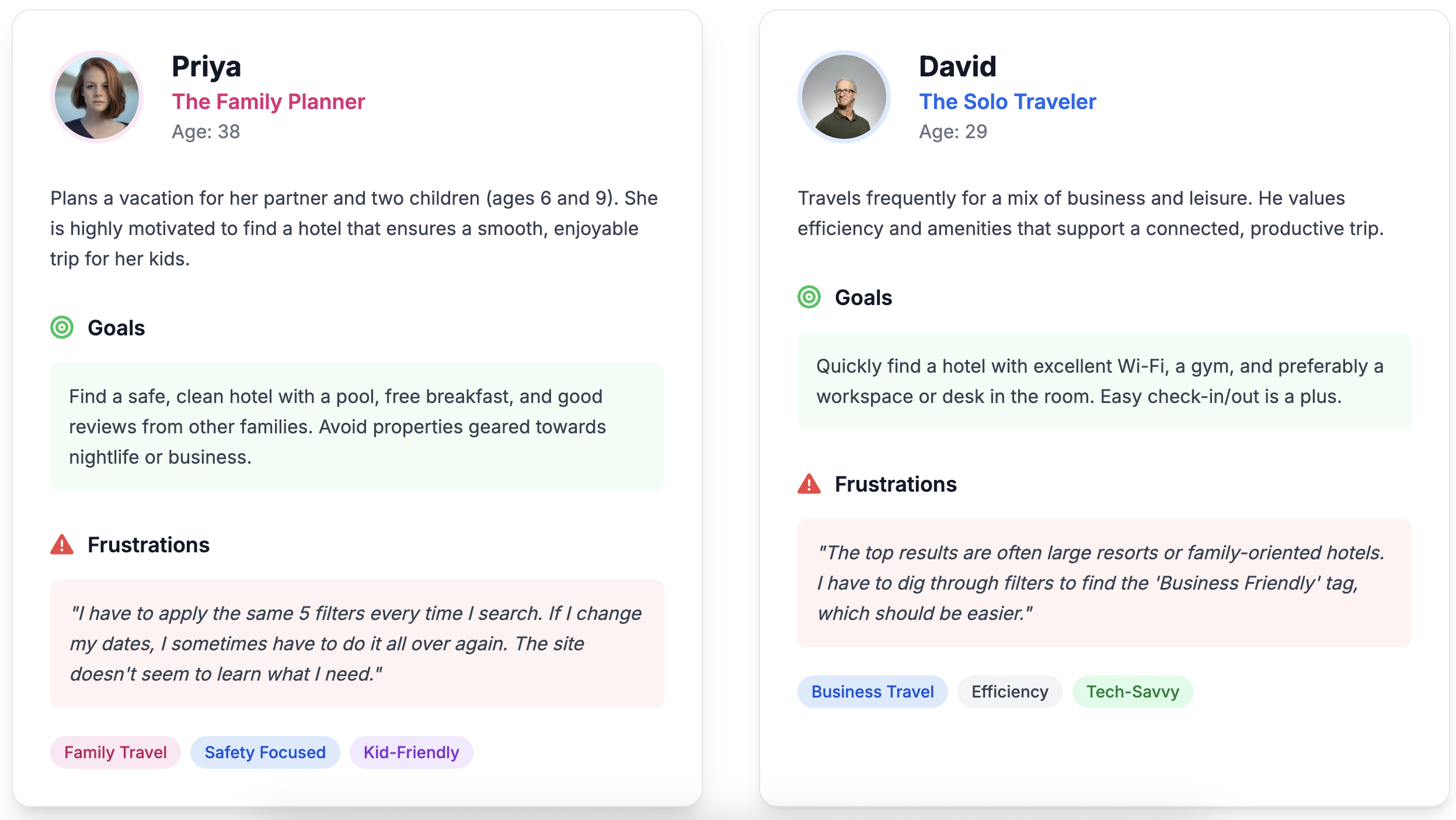
The User: Personas & Journey Mapping
Based on the research, I defined two key personas whose needs were being actively underserved by the current system.
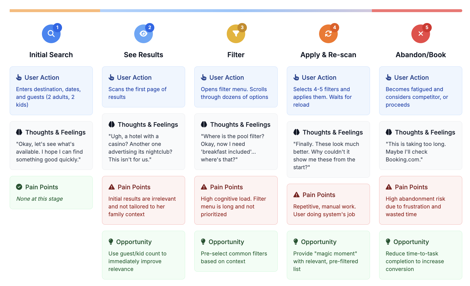
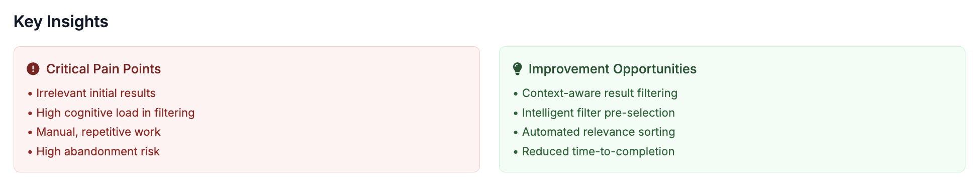
User Journey Map: Priya’s “Filter Fatigue”
This journey map illustrates Priya’s experience searching for family-friendly accommodations, highlighting key pain points and improvement opportunities at each stage.
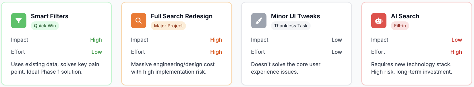
The Strategic Approach: Prioritizing for Impact
To ensure I was solving the right problem in the right way, I mapped potential solutions on an Impact vs. Effort matrix.This prioritization framework is a critical part of the product design process.
The Solution: Detailed Design & Interactions
The final design consists of two parts: the back-end logic and the front-end user interface (UI) design.
A. Preset Logic: The system uses simple, transparent rules.
IF kids > 0 THEN apply "Family Preset"
(e.g., auto-select ‘Swimming Pool’, ‘Family Friendly’).
IF adults == 1 AND kids == 0 THEN apply "Solo Traveler Preset"
(e.g., auto-select ‘Free Wi-Fi’, ‘Fitness Center’). This logic is extensible for other personas like groups or business travelers.
B. UI & Interaction Design: The user interface was designed to be helpful, not intrusive.
The Banner: A single-line, dismissible banner appears directly below the search filters. It uses friendly, transparent language. The microcopy is crucial:
- Good: “We’ve pre-selected some family-friendly filters for you.”
- Better: “✨ We’ve applied filters for ‘Swimming Pool’ and ‘Kids’ Activities’ because you’re traveling with family.”
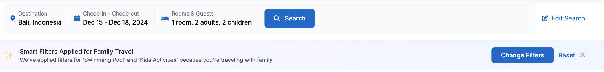
Controls: The banner contains two clear calls to action:
[Change Filters] Opens the main filter menu where the user can see the pre-selected options and modify them.[Reset] A secondary action to immediately remove all smart filters.
Accessibility: The banner is announced by screen readers upon page load. All controls have visible focus states and are keyboard navigable.
Validation Plan & Success Metrics
A robust A/B testing plan was designed to measure the feature’s success against the core business goals. This hypothesis-driven design approach is fundamental to data-informed product development.
- Hypothesis: By intelligently pre-selecting relevant filters based on user context, we will reduce cognitive load, decrease time-to-relevance, and thereby increase user satisfaction and conversion.
Primary Key Performance Indicators (KPIs):
- CSAT (Search Experience): Measured via a one-question survey (“How relevant were these search results?”) shown to a sample of users post-search. Goal: +10% lift.
- Search-to-Booking Conversion Rate: The ultimate measure of business impact. Goal: +1.0pp lift.
Secondary Key Performance Indicators (KPIs):
- Search Abandonment Rate: Percentage of users who perform a search but leave before clicking a hotel. Goal: -10% reduction.
- Time-to-Magic: The time (in seconds) from when the results page loads to the user’s first click on a hotel listing. Goal: -30s reduction.
Guardrail Metrics:
- Page Load Time (Latency): Ensure the feature adds no discernible latency.
- Filter Usage Rate: Monitor if users are interacting with the filters more or less.
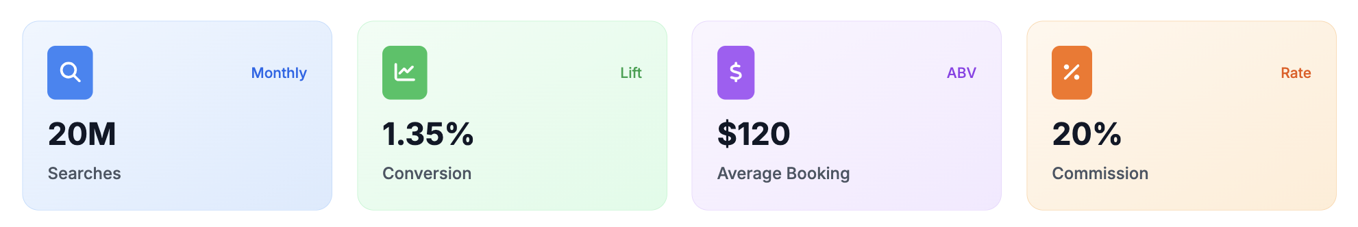
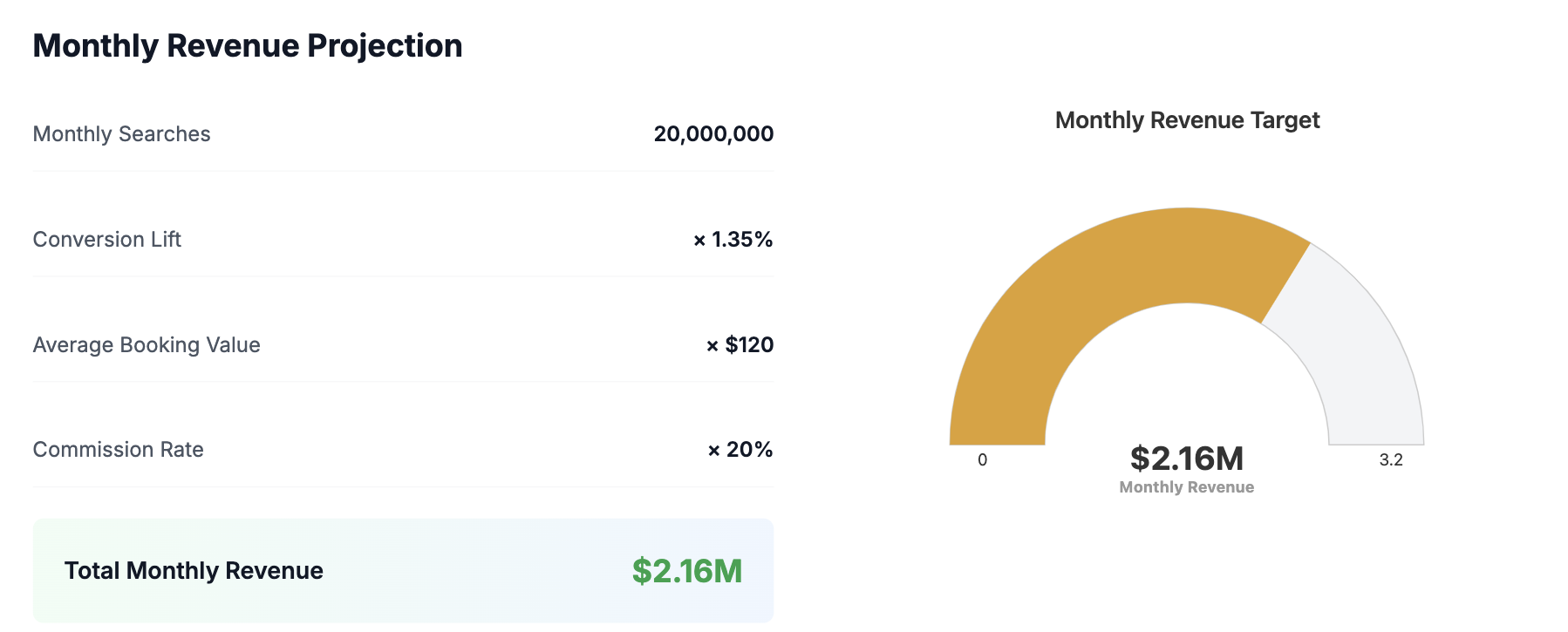
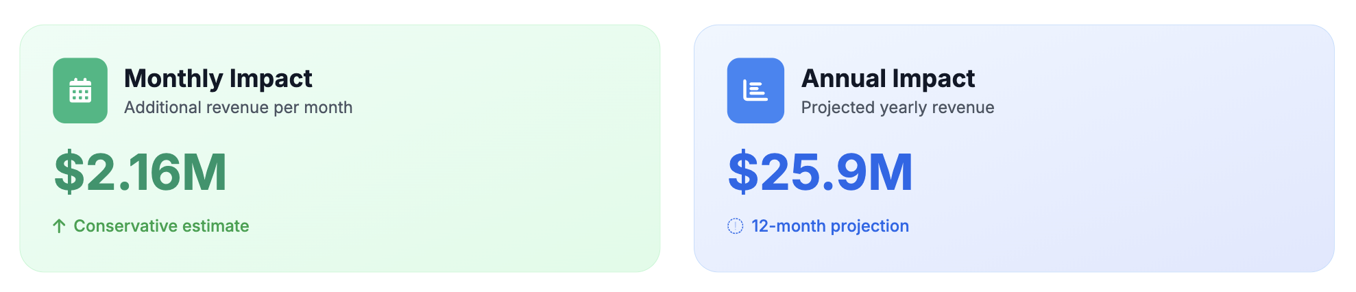
Projected Impact: The Business Case
The modeled results demonstrate a compelling business case for implementation, providing a clear return on investment (ROI) for key stakeholders
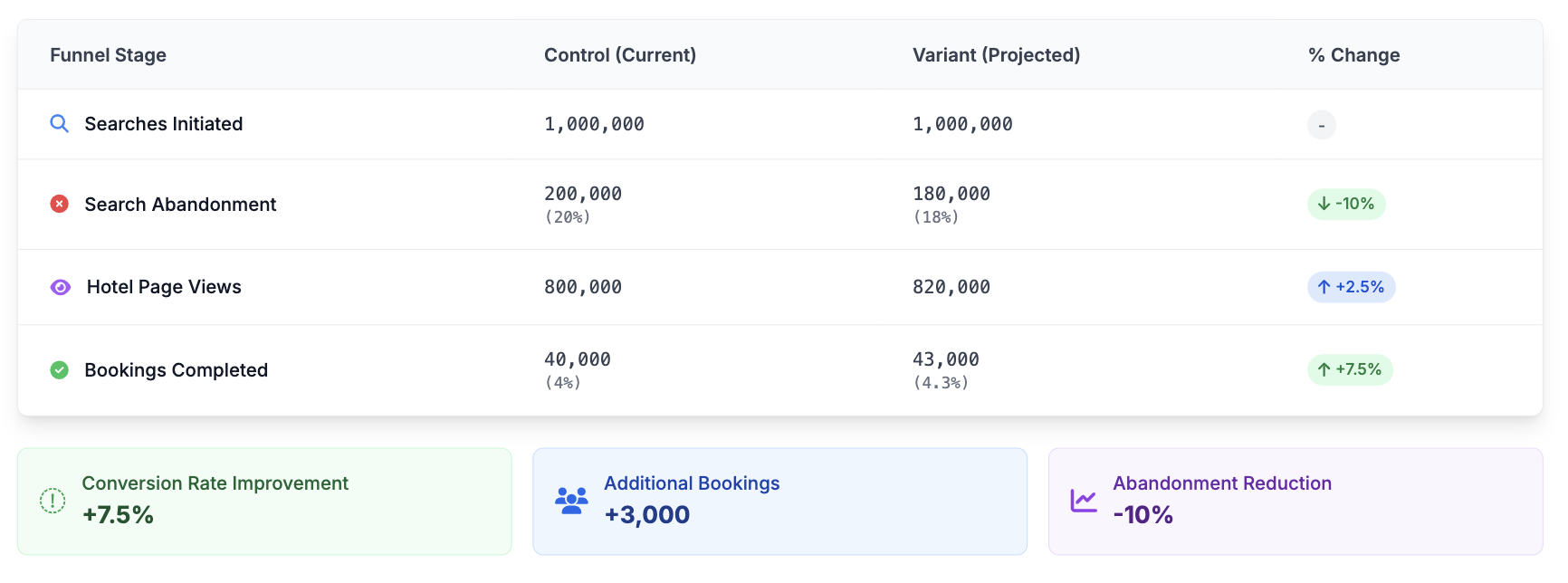
Note: The final booking conversion lift is projected at +1.35pp relative to the overall user base, not just this cohort.
Revenue Projection
Rollout Plan & Future Vision
A. Phased Rollout: To mitigate risk, the feature would be rolled out incrementally as part of an iterative product development cycle:
- Internal Testing & QA: Rigorous testing with internal teams.
- 1% Release: Launch to 1% of eligible global traffic, monitoring guardrail metrics.
- 10% -> 50% Release: Gradually increase exposure while closely analyzing primary and secondary metrics.
- 100% Release: Full rollout upon successful validation.
B. Next Steps (Phase 2 & Beyond): This feature is a foundational step. The future vision includes:
- Learning Preferences: Remembering when a user deselects a smart filter to refine their implicit profile (e.g., “This family traveler doesn’t care about pools”).
- Expanding Personas: Creating presets for “Business Travelers,” “Couples,” and “Groups.”
- Natural Language Search: Evolving the search bar to handle complex queries like “a quiet hotel near the beach with a great pool for kids,” using AI to translate the query into a perfectly filtered results set.
Conclusion & Learnings
The “Smart Filters” project is a powerful example of how deep user empathy, grounded in both qualitative and quantitative data, can lead to solutions that are both simple and profoundly impactful. It proves that sometimes the most significant user experience improvements don’t come from massive redesigns, but from identifying and removing a single, critical point of friction. The key learning is that a system that demonstrates it understands the user’s context, even in a small way, can begin to rebuild trust and turn a frustrating transaction into a delightful experience.