
A concise portfolio piece showcasing a versatile set of communications design mockups created to demonstrate capabilities across print and digital channels. Developed to illustrate how a consistent visual identity can be applied to promotional, editorial and environmental assets, this pack includes an event poster (print + social crop), an A4 publication cover and inside spread, an Instagram post, a wayfinding/signage panel and an email header.
Role and objective
Acting as Communications Designer, I translated a single logo and civic colour cues into a cohesive set of visual solutions that prioritise legibility, accessibility and brand consistency. The objective was to show practical, real-world treatments for time-sensitive campaigns and routine organisational communications.
Approach
Deliverables
Web-resolution mockups for each asset (PNG/JPEG) with captioned previews and suggested specs for future print production.
Accessibility & outcomes
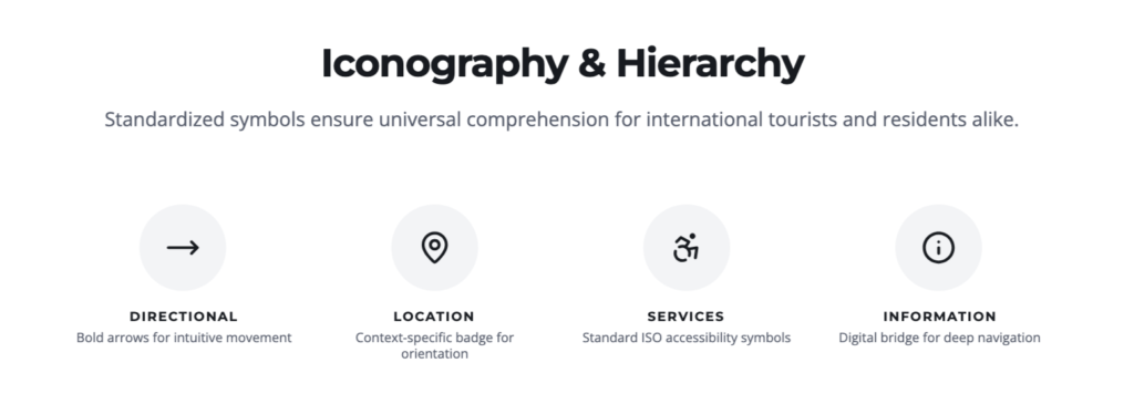
High-contrast type treatments and clear iconography to support readability and wayfinding. These mockups demonstrate practical problem-solving for civic communications and adaptability across formats.
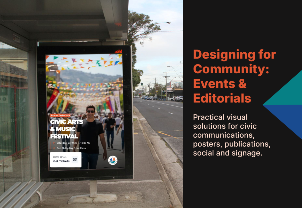
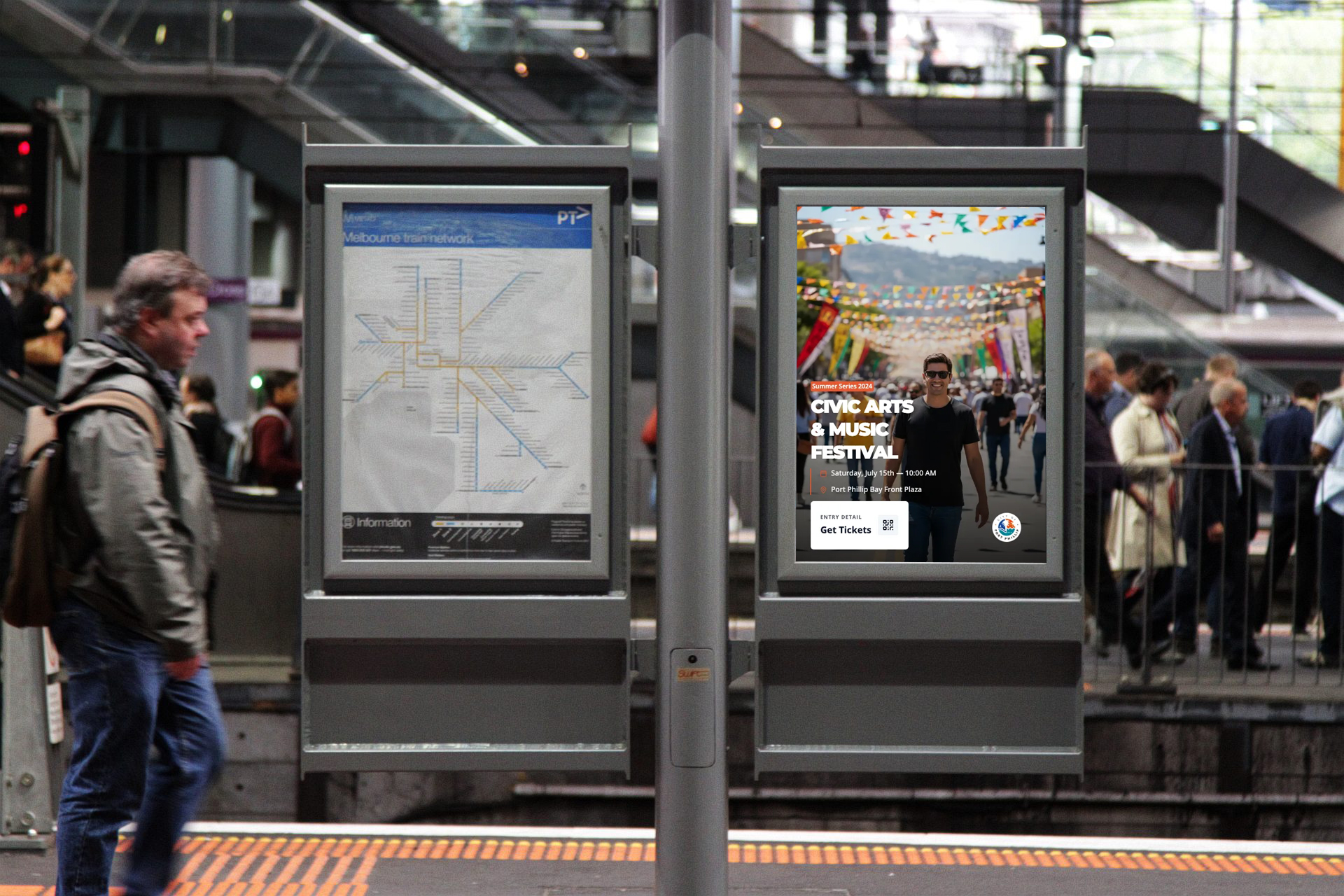
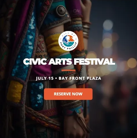
The visual strategy centered on “Structured Energy.” By utilizing a strict rectilinear grid derived from architectural way-finding, I created a stable foundation for dynamic, high-saturation imagery.
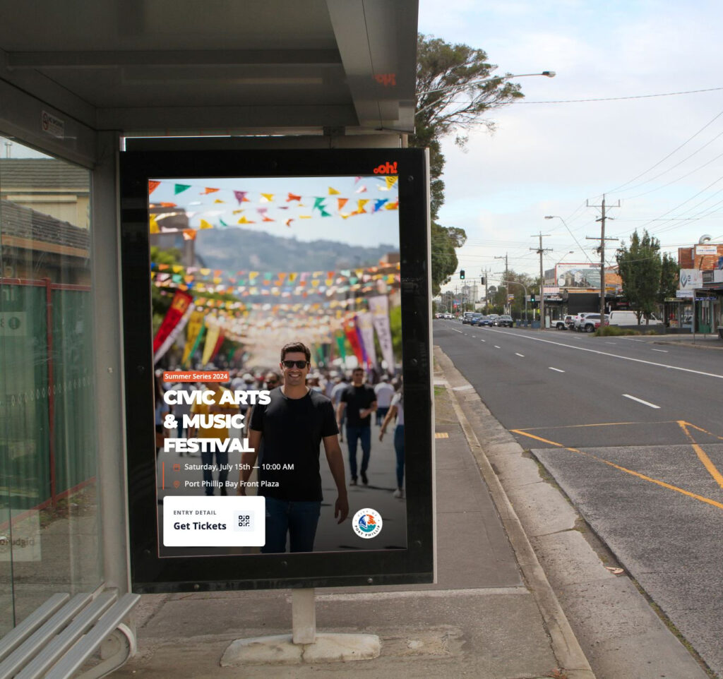
The primary typeface, a customized heavy sans-serif, ensures legibility at a distance of 20+ feet for transit shelter applications while the secondary serif provides a refined institutional feel for date and venue details.
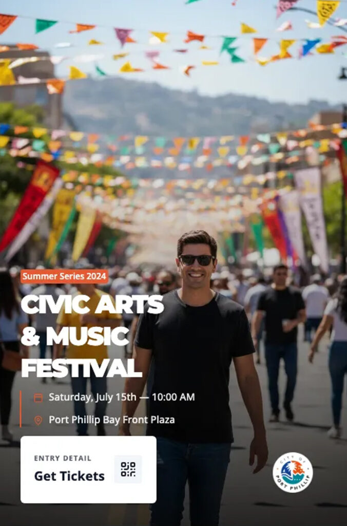
For digital channels, the hierarchy was flattened. The headline was scaled up by 40% and centered to command attention in rapidly scrolling feeds. Supporting text was condensed to critical metadata to ensure readability on small handheld displays
A comprehensive design system for a 120-page civic report. This project showcases meticulous attention to typographic hierarchy, accessible grid structures, and professional print production standards.
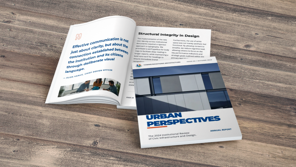
Typographic Hierarchy
Body copy utilizes a highly readable 10pt serif (Lora) with 14pt leading. Headings are set in Inter (Sans-Serif) to provide institutional authority.
Grid Architecture
A modular 12-column grid facilitates versatile layouts while maintaining a consistent visual rhythm across the entire publication.
Print Production
Asset designed for CMYK offset printing with 3mm bleed. Paper stock specified as 150gsm recycled offset for internal pages.
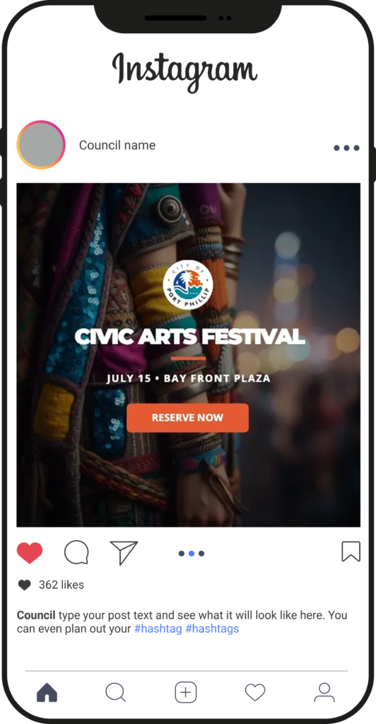
Developing a high-contrast, bold digital identity for municipal social channels. This mockup demonstrates the “Square Post” variant designed for rapid readability within infinite scroll environments.
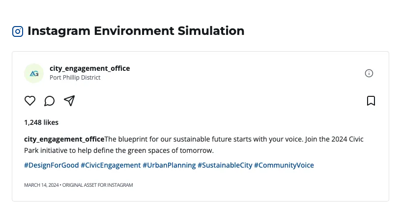
The objective was to create a recognizable “brand block” that stops the thumb. By utilizing the primary municipal blue and a supporting teal, I ensure instant institutional recognition while maintaining a fresh, modern aesthetic for younger demographics.
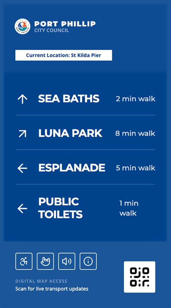
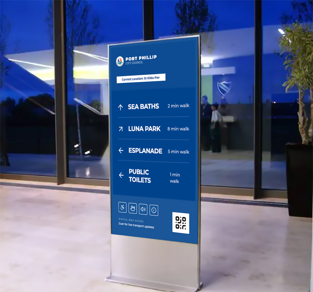
A comprehensive signage system designed for high-traffic coastal environments. Prioritizing rapid information processing through typographic hierarchy and universal symbology.
The challenge was to create a modular signage framework that remains legible under diverse lighting conditions, from direct Australian midday sun to evening ambient light.
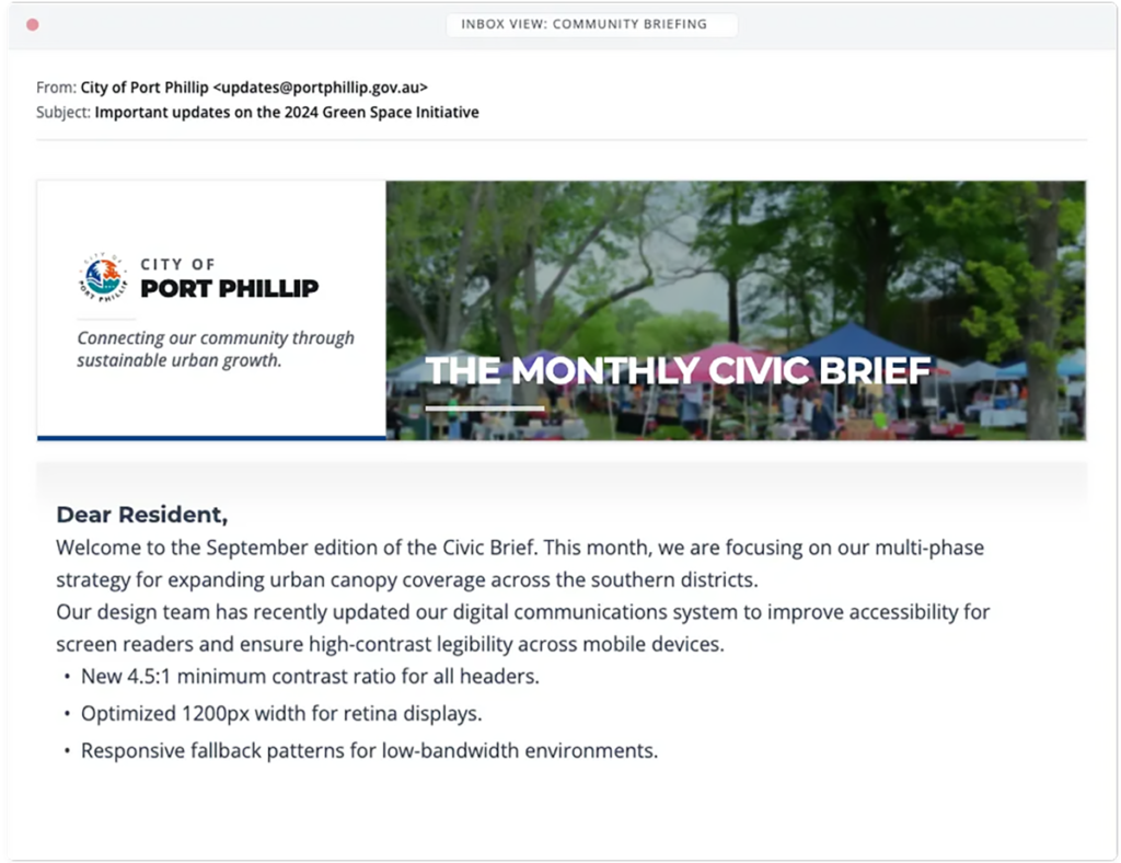
A high-impact digital banner system designed for civic engagement. Optimized for email inbox environments where clear branding and immediate visual context are paramount.
Digital headers in civic communications must perform under technical constraints. The 4:1 aspect ratio was selected to ensure the branding remains visible “above the fold” on most desktop and mobile mail clients without requiring immediate scrolling.
The “Visual Divider”, a subtle 50px gradient shadow, mimics a paper-over-table aesthetic, mentally preparing the user to transition from the “announcement” header into the “information” body text.

This sample pack demonstrates how a consistent visual system, built from a single logo and palette, can be adapted across event promotion, editorial material, social content and way-finding. The designs prioritise accessibility, clarity and cross-channel consistency.
These mockups were intentionally produced as web-resolution previews using royalty-free imagery and lorem ipsum copy to showcase structure and brand application rather than final content. If you like what you see, I can prepare print-ready files, develop full campaigns from these concepts, or adapt the system for other channels. Let’s discuss how the approach can meet your specific accessibility, production and timeline requirements.