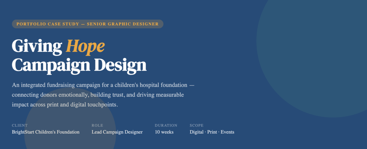
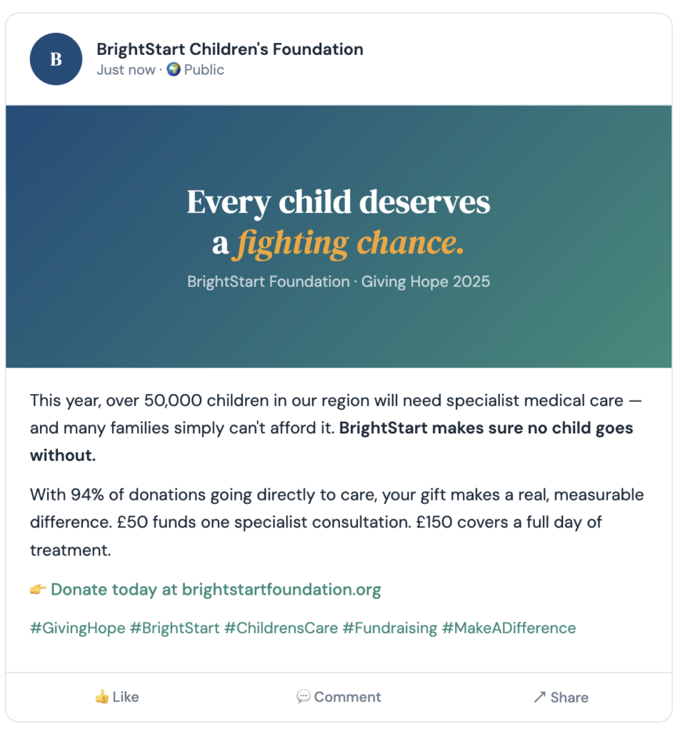
BrightStart Children’s Foundation needed a campaign that would resonate deeply with individual donors, corporate sponsors, and community members. The brief called for a comprehensive visual identity system spanning digital, print, and event channels, all working together to tell one cohesive story: that every donation changes a child’s life.

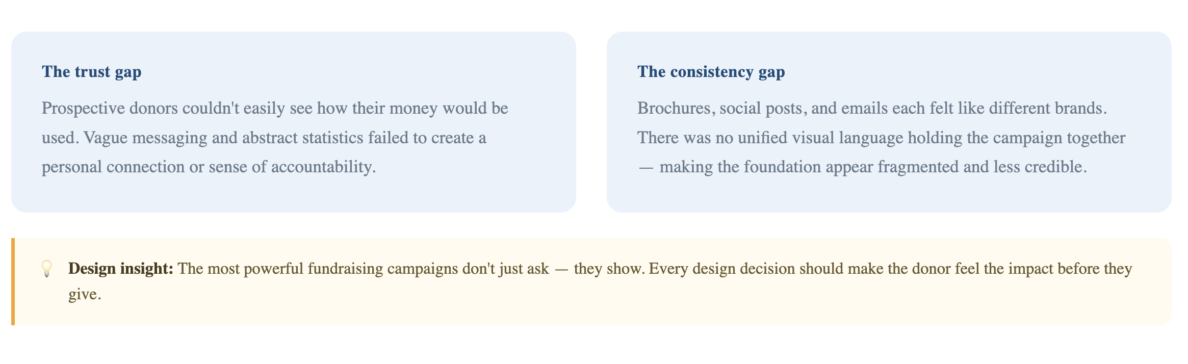
Despite doing vital work, the foundation’s previous campaigns felt generic, corporate tone, inconsistent visuals, and a lack of emotional resonance. Donor engagement rates were declining and the visual language didn’t reflect the humanity at the core of the mission.
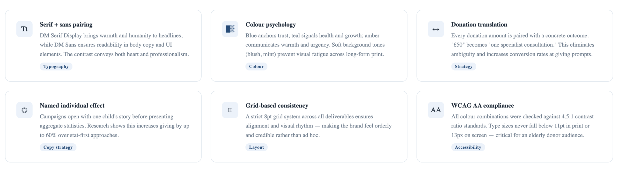
Rooted in strategy before aesthetics, the campaign was shaped around six clear design objectives that drove every creative decision.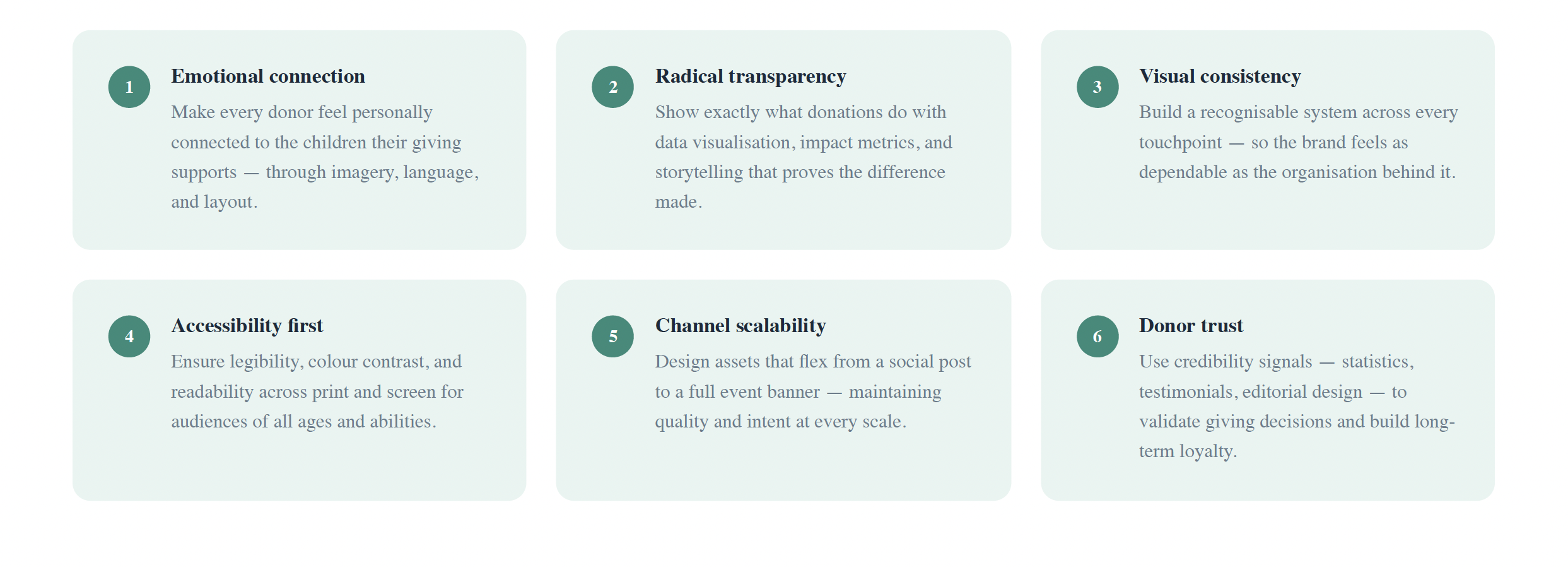
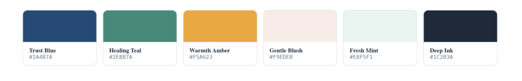
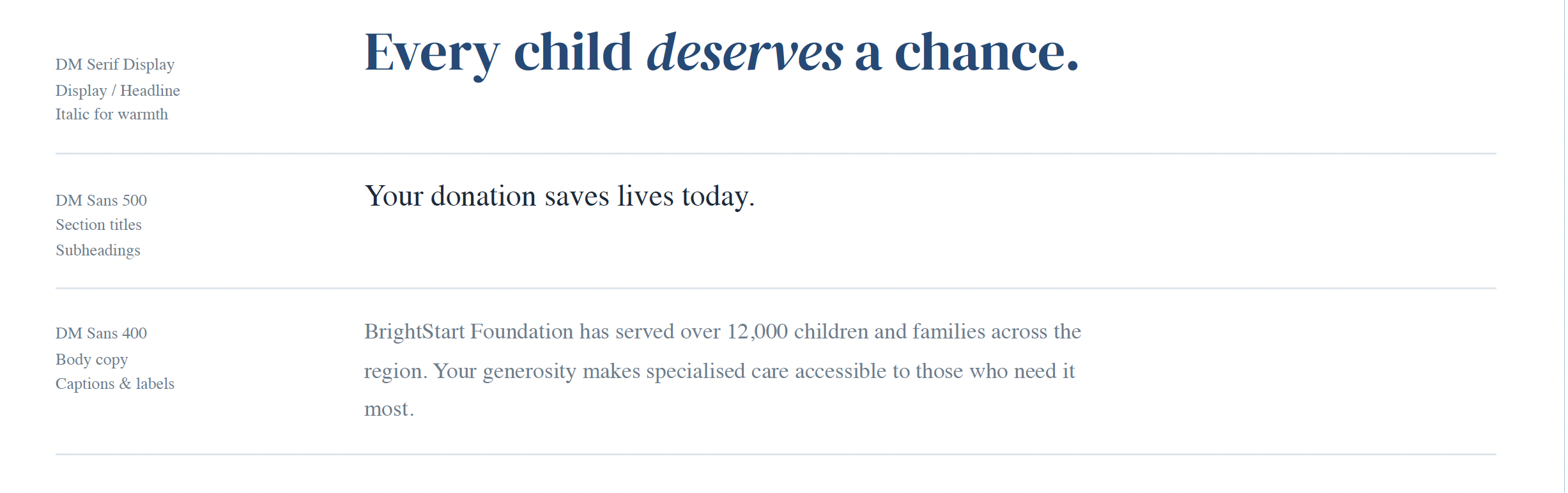
The design system was built to feel warm yet professional, approachable for families, credible for corporates, and emotionally resonant for individual donors.
COLOUR PALETTE
TYPOGRAPHY
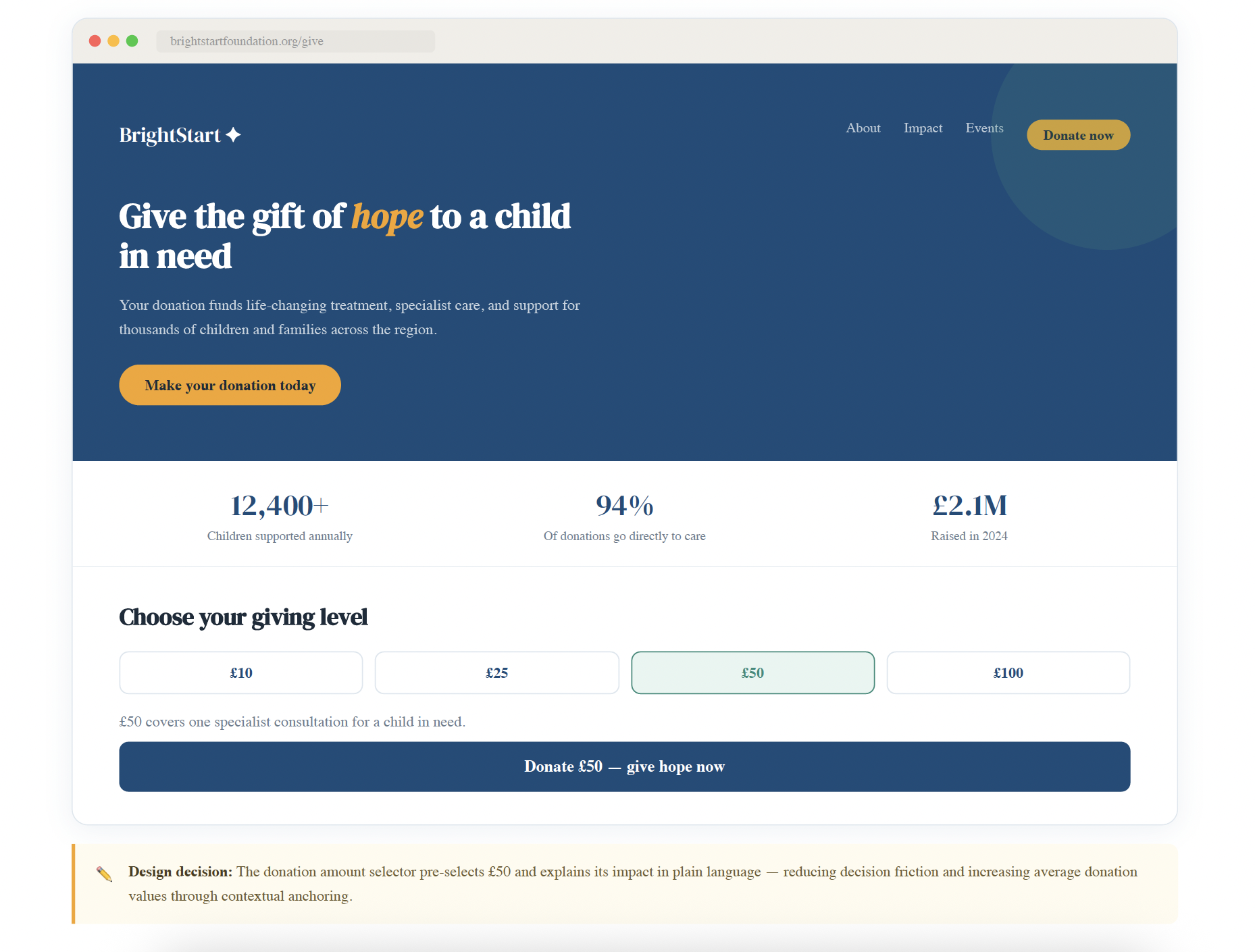
CORE COMPONENTS

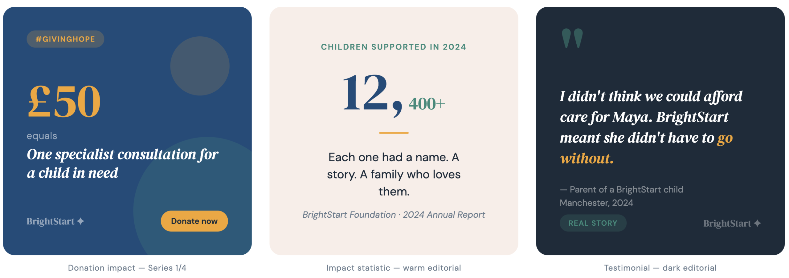
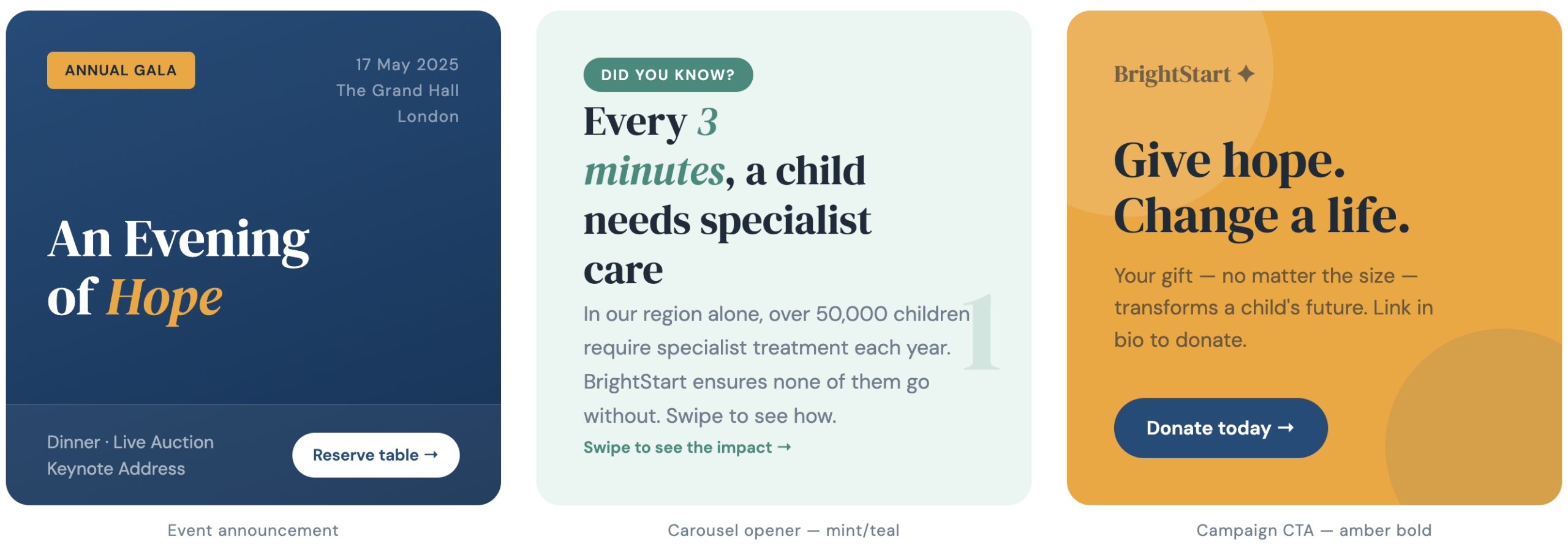
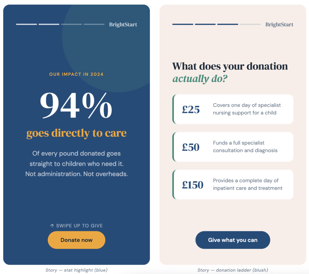
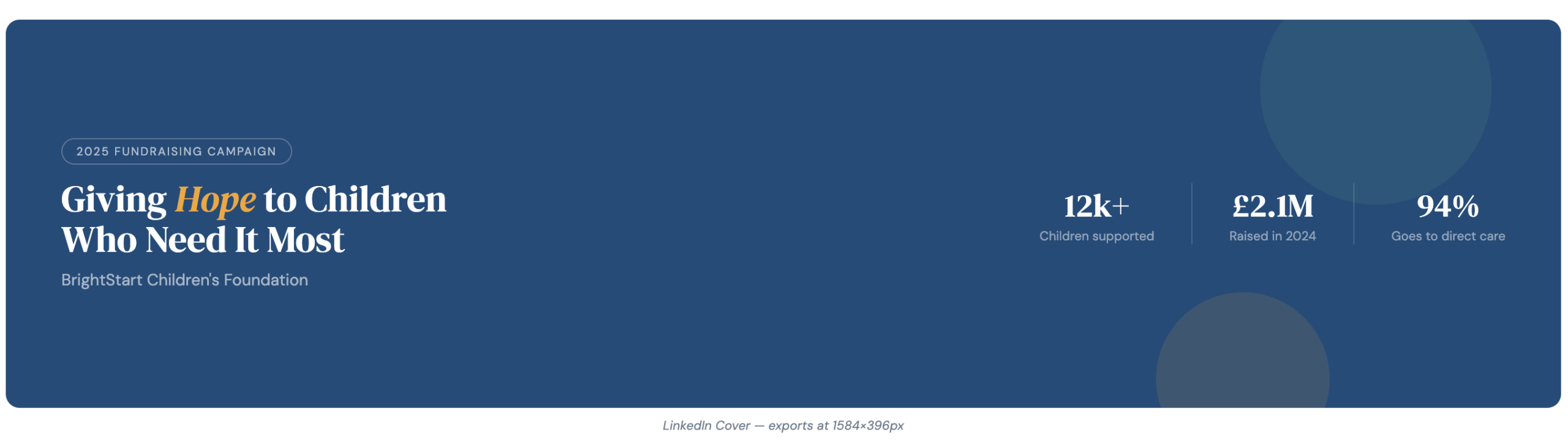
Each touchpoint was designed as part of the integrated system, maintaining visual continuity while adapting layout and content density to the channel’s demands.
Landing Page
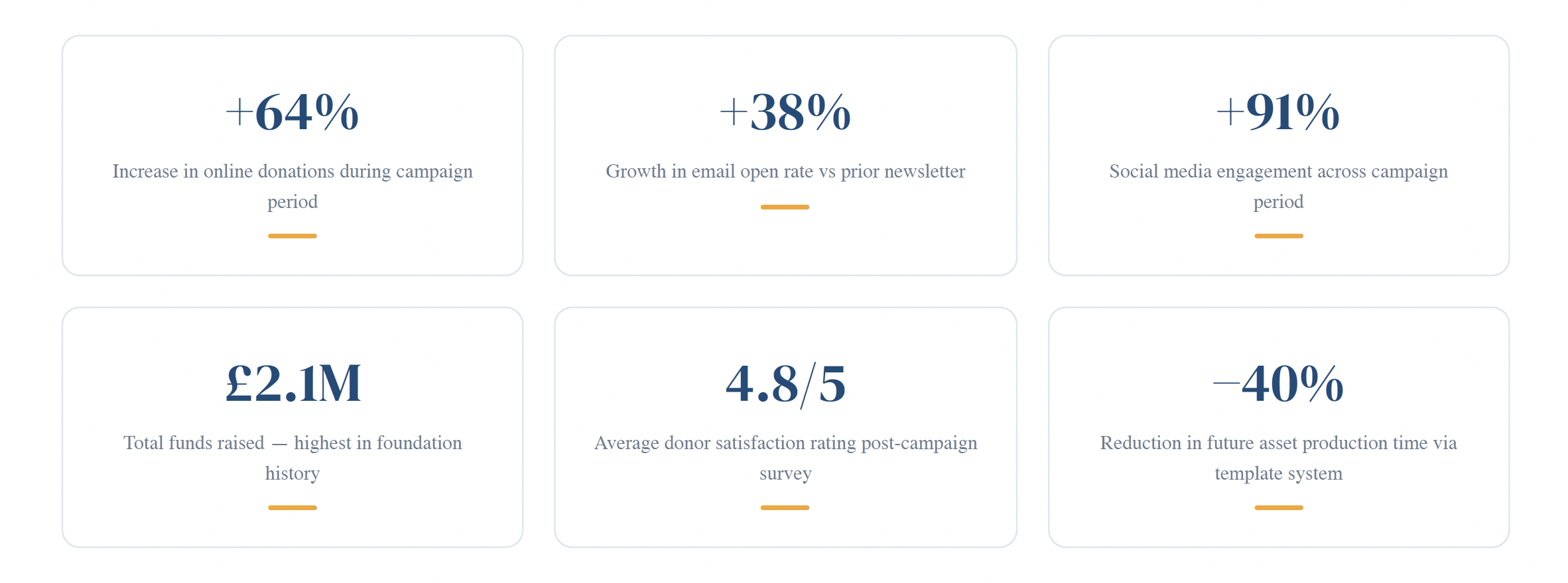
Following the campaign launch, the foundation recorded measurable improvements across all key donor engagement and conversion metrics. The unified design system also reduced future production time by standardising asset templates.